What Is the Mauve Color?
Mauve in color is a shade with both historical depth and modern aesthetic appeal. It brings a refined, soft, and nostalgic visual experience to your designs.
This article aims to provide a comprehensive mauve guide for designers, artists, and color enthusiasts. We will delve into its origins, color psychology, schemes, and practical applications. By mastering this unique bluish-purple hue, you will be able to significantly enhance the texture and emotional depth of your creative work.
What Is the Mauve Color?
Mauve is a soft bluish-purple hue that perfectly balances the mystery of purple with the calmness of gray. The color gets its name from the French word for the Mallow flower, “Malva“. Its historical significance is profound.
In 1856, William Perkin, an 18-year-old English chemist, accidentally discovered this synthetic dye while trying to synthesize quinine. This dye, named “Mauveine,” was the first synthetic organic dye in human history. Its emergence completely transformed the fashion industry and chemical manufacturing. It made purple accessible to the masses, no longer reserved for royalty.
| Feature | Description |
| Color Family | Soft bluish-purple hue |
| Hex Code | #E0B0FF (Light Mauve) |
| RGB | R: 224, G: 176, B: 255 |
| CMYK | C: 12%, M: 31%, Y: 0%, K: 0% |
| Origin | Accidentally discovered by William Perkin in 1856 |
The Color Psychology of Mauve: A Symbol of Nostalgia and Nobility
Mauve symbolizes nobility, nostalgia, spirituality, and subtle romance in color psychology. This color blends the energy of red with the tranquility of blue. It conveys a mature and insightful emotion. In design, using mauve can create a refined, elegant, and slightly melancholic atmosphere. It is often used to express a longing for the past. Simultaneously, it also represents innovation and uniqueness. This is because it was an innovative product in chemical history.
Color psychology comparison summary
| Color | Core Emotion | Symbolism | Application Scenarios |
| Mauve | Soft, Introspective | Nostalgia, Nobility, Innovation | Weddings, Vintage Design, High-end Brands |
| Lavender | Fresh, Serene | Purity, Calmness, Grace | Baby Products, Spas, Spring Themes |
| Violet | Intense, Mysterious | Spirituality, Luxury, Magic | Religion, Luxury Goods, Sci-Fi Themes |
| Purple | Authority, Power | Royalty, Wisdom, Ambition | Leadership, Education, Creative Industries |
Mauve’s Rich Shades and Color Schemes
Mauve has various shades, and each tone brings a unique visual experience. Understanding these shades helps designers make more precise color choices. For instance, Dark Mauve (#874C62) appears more mature and stable. Conversely, Light Mauve (#C292A1) is softer and warmer.
Overview of Common Mauve Shades
| Shade Name | Hex Code | Emotional Tendency |
| Heather Mauve | #A14189 | Natural, Lucky, Protective |
| Light Mauve | #C292A1 | Warm, Soft, Comfortable |
| Mauve Pink | #C77398 | Lively, Saturated, Feminine |
| Dark Mauve | #874C62 | Mature, Reserved, Deep |
| Rose Mauve | #AF9690 | Vintage, Warm, Earthy Tones |
Complementary color schemes create a strong visual impact. Mauve’s complementary color is Yellow-Green (e.g., Chartreuse #CFFFB0). This contrasting combination is often used to highlight key elements. Analogous color schemes create a harmonious and unified atmosphere. For example, combining Mauve with Pale Pink (#FFB0F7) and Mauve Blue (#B9B0FF) can present a gentle and peaceful visual effect.
Application Cases of Mauve in Design
Mauve is highly favored in various design fields due to its unique soft and noble temperament. Mastering its application scenarios helps you better integrate this color into practical projects.
Case study 1: interior design
Mauve is an ideal choice for creating a vintage, luxurious bedroom atmosphere. It can be used as the main wall color or for soft furnishings. Paired with gold or dark wood furniture, it instantly enhances the space’s refinement and layering. In modern minimalist styles, a touch of Light Mauve on a throw pillow or rug can break the monotony. It adds a soft, feminine charm.
Case study 2: branding and fashion design
Many high-end brands choose Mauve to convey their unique brand identity. This color is often used in cosmetics, perfumes, and wedding dress designs. It embodies an elegant, romantic, and unconventional brand image. For example, using Mauve on wedding invitations or brand packaging immediately gives the product a premium feel.
Case study 3: digital art and UI design
In digital art creation, Mauve is often used to depict dreamy, sci-fi, or nostalgic themes. It can serve as a background color or for lighting effects. In User Interface (UI) design, soft Mauve can be used as an accent color. It is suitable for buttons or notification prompts. This provides a comfortable and non-glaring visual experience.
How to Create Photo in Mauve on Dzine?
Dzine, as a powerful AI design tool, helps you easily realize creative applications of Mauve. Whether you want to experiment with different Mauve shades or integrate it into complex backgrounds, Dzine offers efficient solutions.

Step 1. Sign up and get your free trial.
Dzine provides a 7-day free trial for every new user. After signing up, you can not only generate your ideal mauve color image but design any wonderful masterpiece.
Step 2. Choose a model
Users can figure out 120+ effects and 12+ general models, like Nano Banana Pro, Midjourney, Google Imagen 4 and so on.
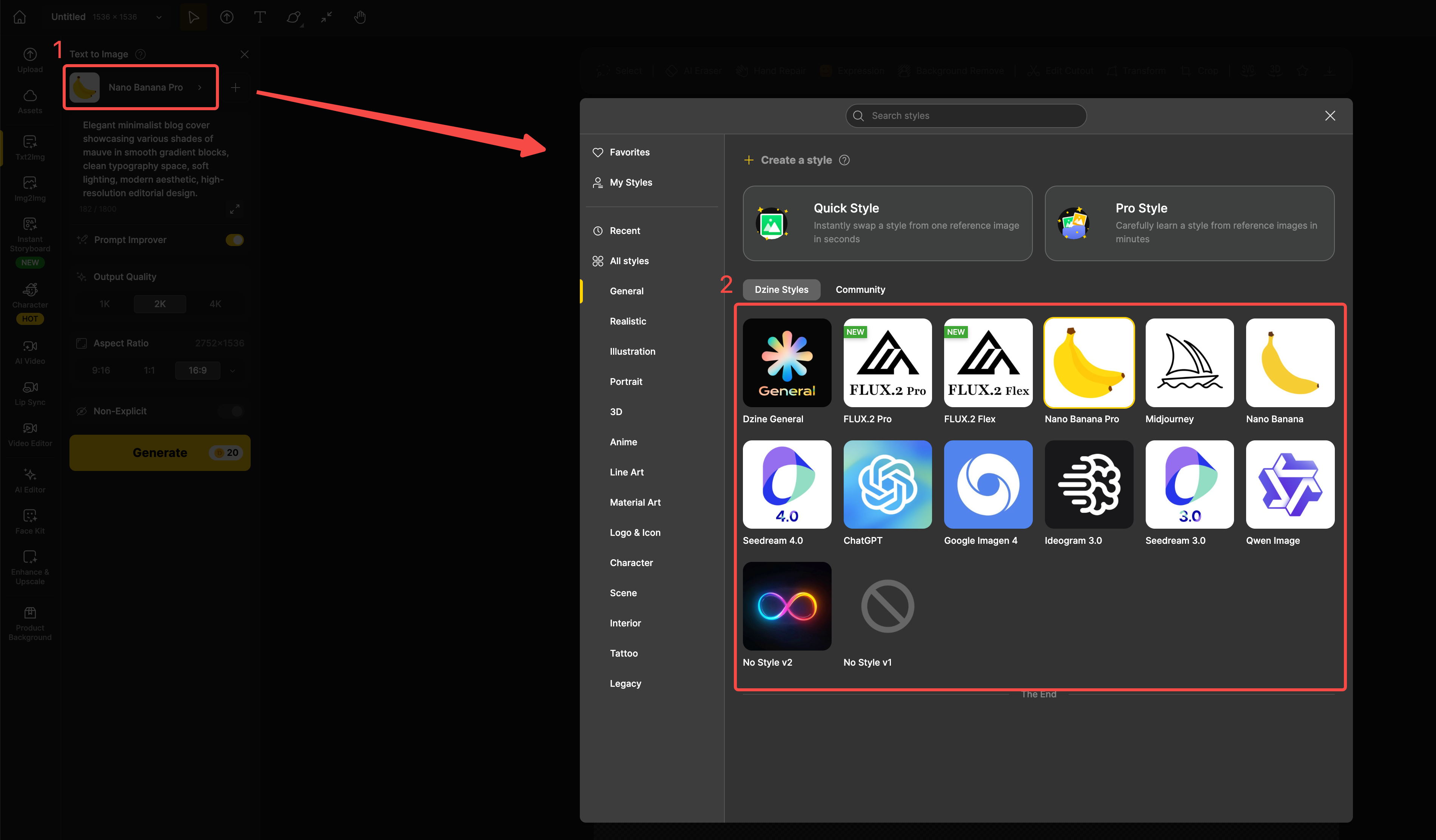
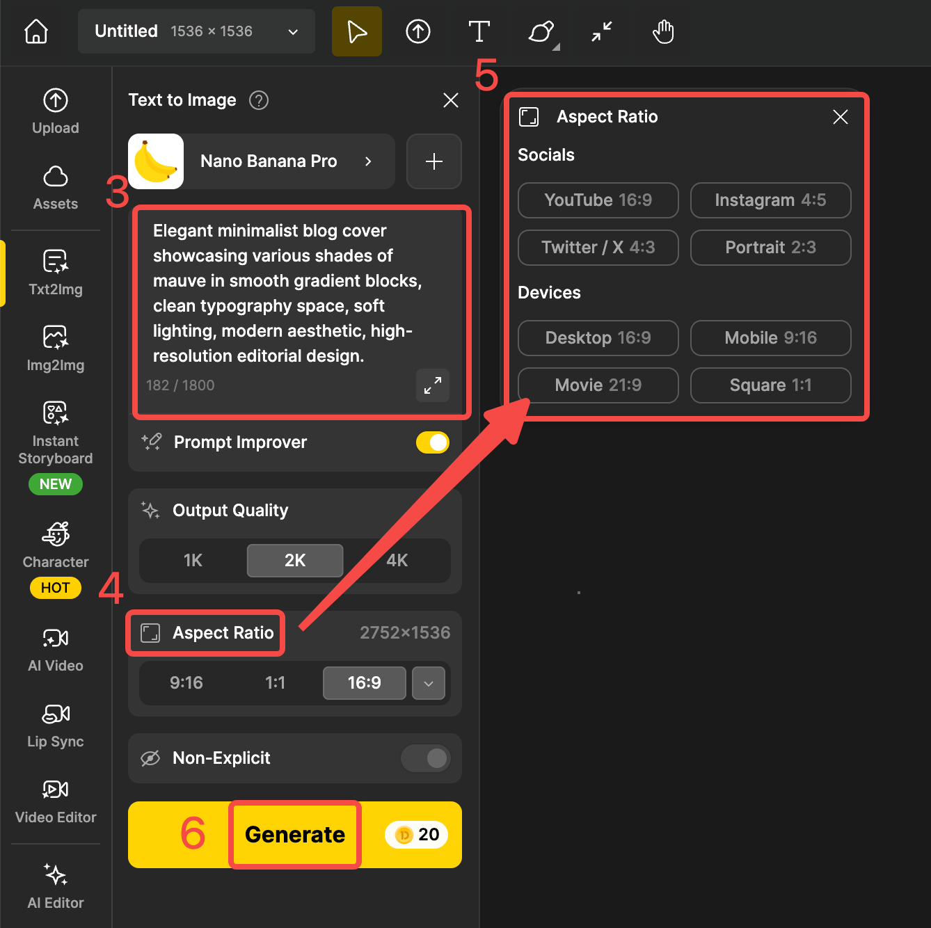
Step 3. Set parameters and generate images
Now, please tell Dzine what your needs about Mauve color images using natural words. Before generating the image, we recommend that you check the output quality and aspect ratio to avoid images that do not meet your requirements.
Integrates with other Dzine image editors
- AI Art Generator: You can use Dzine’s AI Art Generator tool. Input keywords like “Mauve in color, nostalgic style” to quickly generate themed artworks.
- Background Transformation: Want to change the background of a product image to Mauve? Dzine’s Transform Backgrounds feature can do it with a single click. No complex Photoshop operations are needed.
- Color Filters: Using the AI Photo Filter tool, you can adjust the overall photo tone to a soft Mauve filter. This instantly creates a vintage or romantic atmosphere.
Ending Thoughts
Mauve in color is a shade full of storytelling and noble temperament, worth exploring in your designs. It is not only a witness to history but also an indispensable part of modern aesthetics. By understanding its psychological meaning and pairing principles, you can create visual works with greater emotional resonance.
Do you want to personally experience the charm of Mauve? Try Dzine AI Now and Start Your 7-Day Free Trial
FAQs
Q1: What is the difference between Mauve and Lavender?
A: Both Mauve and Lavender are soft shades of purple. However, Mauve contains more gray and blue tones, making it appear calmer and more nostalgic. Lavender has more pink tones, feeling fresher and sweeter.
Q2: In which era was Mauve most popular?
A: Mauve first reached its peak popularity during the Victorian Era (mid-to-late 19th century). This was thanks to William Perkin’s discovery. At the time, it was known as “Mauve Mania.” It swept across the entire European fashion world.
Q3: How can Mauve be safely used in web design?
A: In web design, it is recommended to use Mauve as an accent or background color. Avoid using it for large blocks of text to ensure readability. Using a Light Mauve (e.g., #E0B0FF) as a background, paired with dark text, can create a soft yet professional visual effect.